How to transfer your inspirational paint colours from your mood board to your wall.

So, here we are. You have had tea and biscuits, and had time to admire your ‘mood board’ from Part 1 of ‘Paint colours to brighten your home’. You have read ‘Some basics in how to make the right colour choices for you’ which taught you how to use experiences in your life to inspire your paint colour choices. So lets get started on Part 2!

Without boring you to tears I am going to explain some basic colour theory. I will also provide you with examples of colour combinations. This will help you to consolidate your choices into a cohesive plan for your final paint colours. Sound good?
Colour is an infinite tool to embrace and use in all aspects of your life. In fact, it’s hard to live a life with no colour at all. Nature alone provides so much inspiration and its important to open our eyes and embrace all its offerings! There is no point walking around with your head down and tail up. You will miss all the good stuff!
The First Colour Wheel
The first Colour Wheel was invented by Sir Isaac Newton. With a prism, he split white sunlight into red, orange, yellow, green, violet and blue beams. The colour wheel is an abstract organisation of these hues around a circle. It helps one determine (in general terms) what colour will go with what.
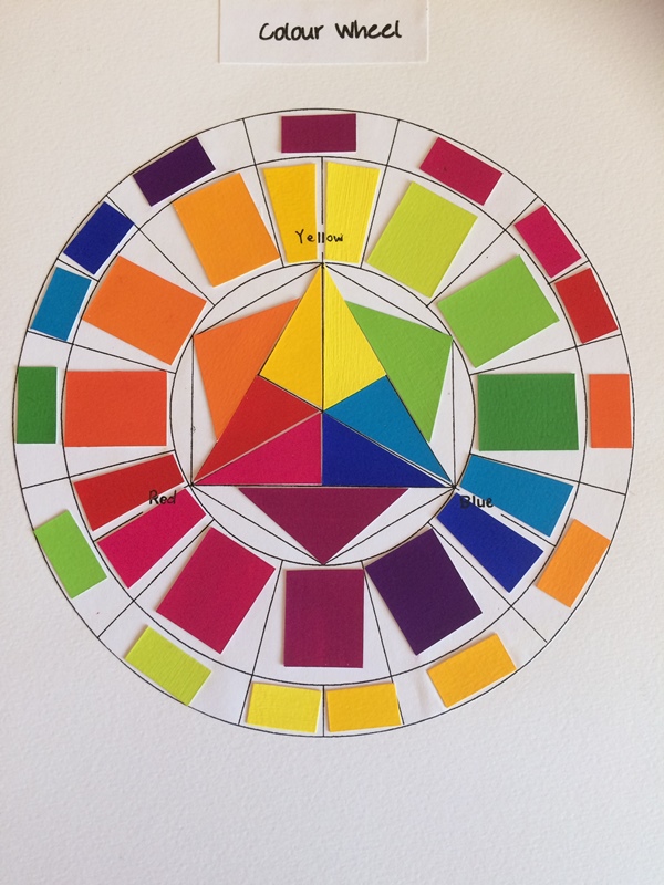
It shows the basic:
- Primary Colours – the inner triangle,
- Secondary Colours – the second outward facing triangles,
- Tertiary Colours- the inner circle
- Complimentary Colours- the outer circle.
From these basic combinations the possibilities are endless and that’s not taking into account adding black, white or grey to colours to create monochromatic colour schemes or chromatic reduction schemes. There are also many more tricks to making new and exciting colours which I will not go into here. I painted all these colour chips which was very time consuming but well worth the process! Anyway… I will not babble on into too much detail!
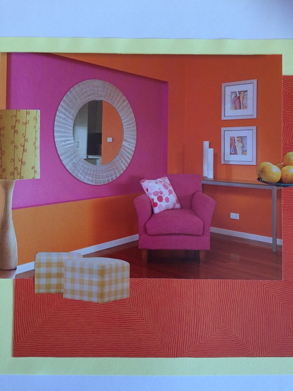
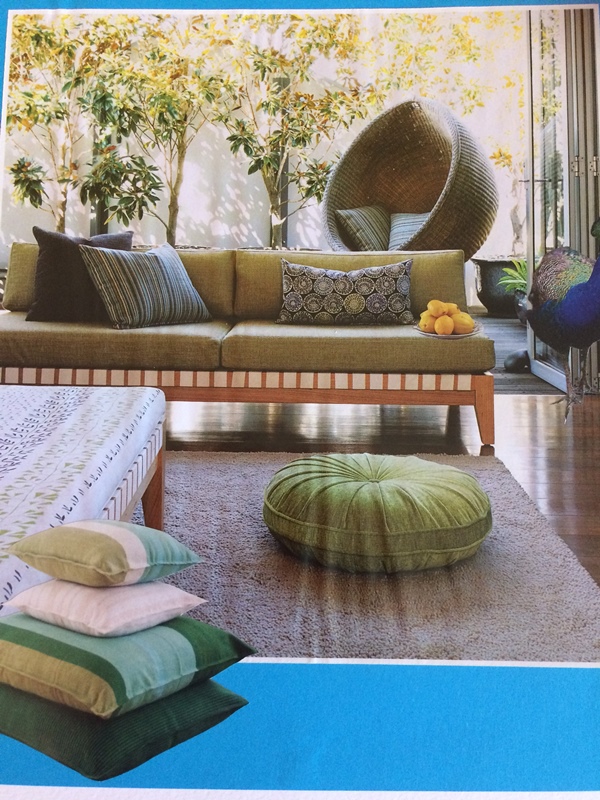
3 examples of Secondary Colour Schemes with variations of hues.
Orange

Green

Magenta

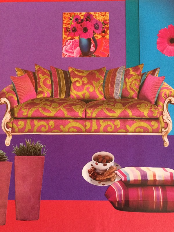
When looking at these examples try and pick out the individual colours that correlate with the colour chits beside the image. This may seem tedious when you are doing it consciously but we actually do this naturally all the time without thinking about it.
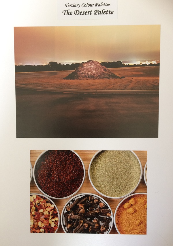
3 examples of Tertiary Colour Schemes with variations of hues.


Deciphering your mood board
Now look at your own personal ‘mood board’. Start dissecting your collection of ideas by separating the colours. What is the dominant colour? What is the second most dominant colour? How do these relate to the colour wheel? Can you see that they complement each other? Take notes if you need to.
I am just giving you the basics here but by going through this process you will start to attune your eye to how colours ‘play’ with each other. Combinations you love will start to emerge.
When you have picked out the two or three dominant colours walk into your bedroom and open your wardrobe. See if you can find some article of clothing that is similar to each colour you have chosen. It doesn’t need to be an exact match. If there is nothing in your wardrobe, check out the linen closet! It may end up being a towel, a sheet, a shirt or a trousers. It actually doesn’t matter what it is, its the colour we are interested in.

Taking one colour at a time, hang your item up near the wall to be painted. If you can’t hang it anywhere, drape it over a chair so you can view it while casually walking in and out of the room. This may seem a weird thing to do but we actually do not stand and star at our walls…unless, of course you are particularly exhausted and feeling a bit brain dead, which I have been known to feel from time to time!
Anyway…we view our wall paint colours as part of the whole package of the room. This means that we capture glimpses of the colours as we go about our daily lives. In this context we intuitively know if a colour is what we like by doing this. We will also ‘feel’ if it is what we are after. Try it.
Leave the item there for several days and view it through night and day. If it is hanging beside all your current homewares and furniture, all the better!
Remember you are trying to decide on one dominant paint colour therefore you will probably eliminate one or two of the colours through this process. Trust your instincts!! No one is going to judge you, it’s just the process.
Once you have whittled your choice down to one colour and it has the right feeling and go ahead from you and/or your family etc….you are ready for the next step….the Paint Shop to choose your paint colours! Take your trusted item with you so you can relate back to your chosen colour, even take photos of your ‘mood board’ with you.
Don’t get too caught up in the exact colour at this stage. Choose variations of your chosen colour then play around with the intensity or subtleties of the hue. Do you want your wall to be bold and highlight your furniture and accessories? Or do you want the wall to blend into the environment and be understated? Its important to think on these as you go about your decision making.

Remember…..this is your home and you are choosing the paint colours that are right for you. It takes time to get it right. Get sample pots if need be and if you don’t wish to paint the wall to sample the colour , paint it on a large sheet of paper first and hang it up near the wall. Try not to rush your decision. Take time to reflect on your mood board and what you are trying to achieve.
And what is the worst thing that can happen if you make the wrong choice?…..it is not the end of the world.Have fun and enjoy the process
Kaye xx
Please visit my Instagram and Interiors page for more inspiration and sign up to my Bugger Beige – Don’t conform to the norm – Newsletter